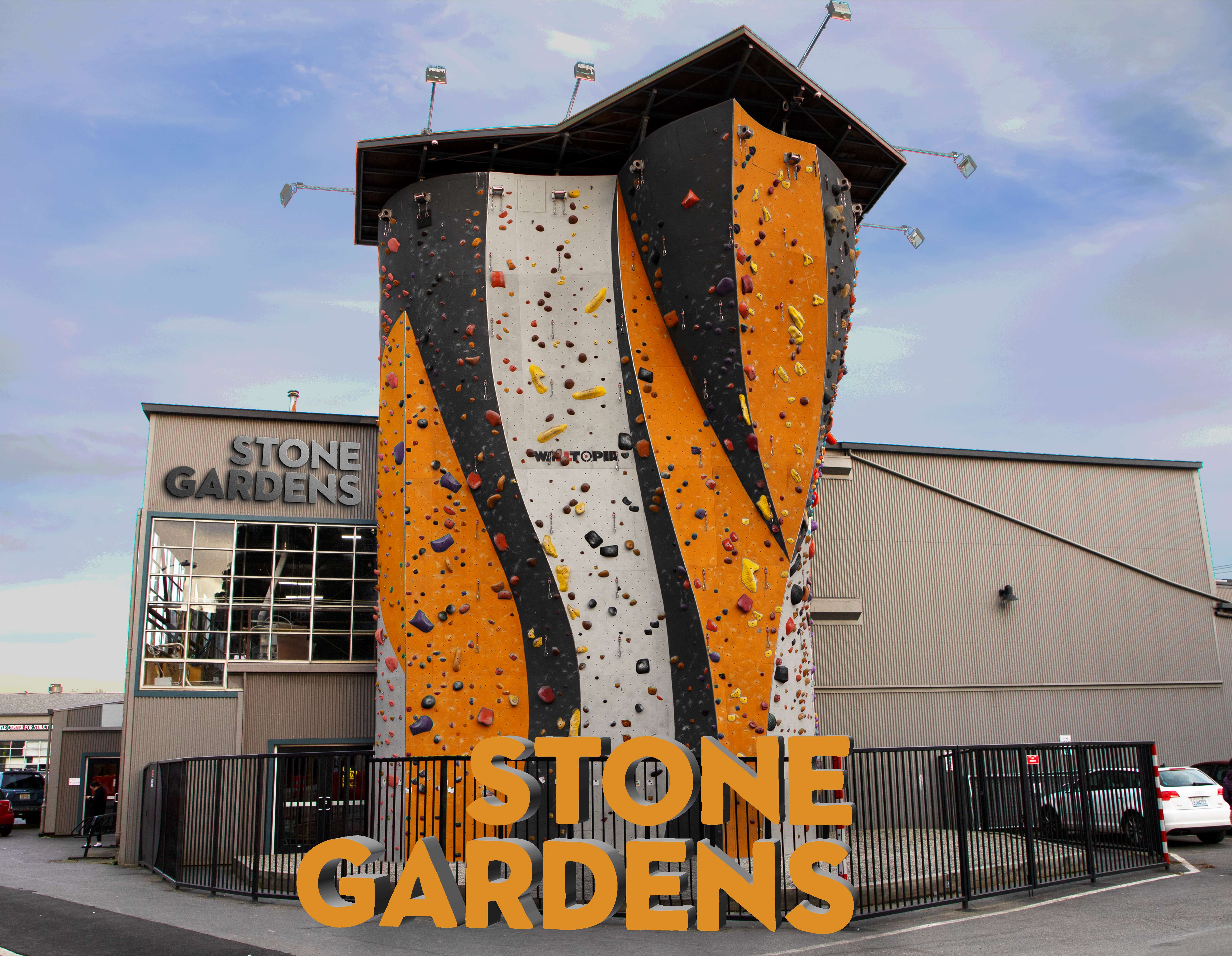
Stone Gardens Climbing Gym
TEAM
Valeria Borodina
Valeria Borodina
ROLE
Concepting
Branding
Art Direction
Visual Design
Concepting
Branding
Art Direction
Visual Design
TOOLS
Illustrator
Photoshop
Indesign
After Effects
Illustrator
Photoshop
Indesign
After Effects
TIMELINE
10 Weeks
10 Weeks

Challenge
Stone Gardens Climbing Gym, founded in 1995, is among the oldest in the Seattle area and helped spur the popularity of indoor climbing nationally. However, the brand hasn’t been updated since its founding and looks firmly dated to the mid-90’s. The gym runs the risk of losing relevance in a city with multiple newer and sleeker climbing gyms competing for members. We sought to give the brand resonance with the current market as well as preserve an authentic connection with the community behind it.

Solution
We crafted a unique look that reflects the values of today’s Stone Gardens community and maintains the authentic, DIY passion that has defined Stone Gardens since the beginning. We found an opportunity to position Stone Gardens as the premier climbing gym for dedicated, advanced and friendly climbers in the Seattle Area. Organic shapes, contour-line illustrations and vibrant, nature-inspired colors bring the gym’s brand into the 21st century while maintaining its beloved retro soul.
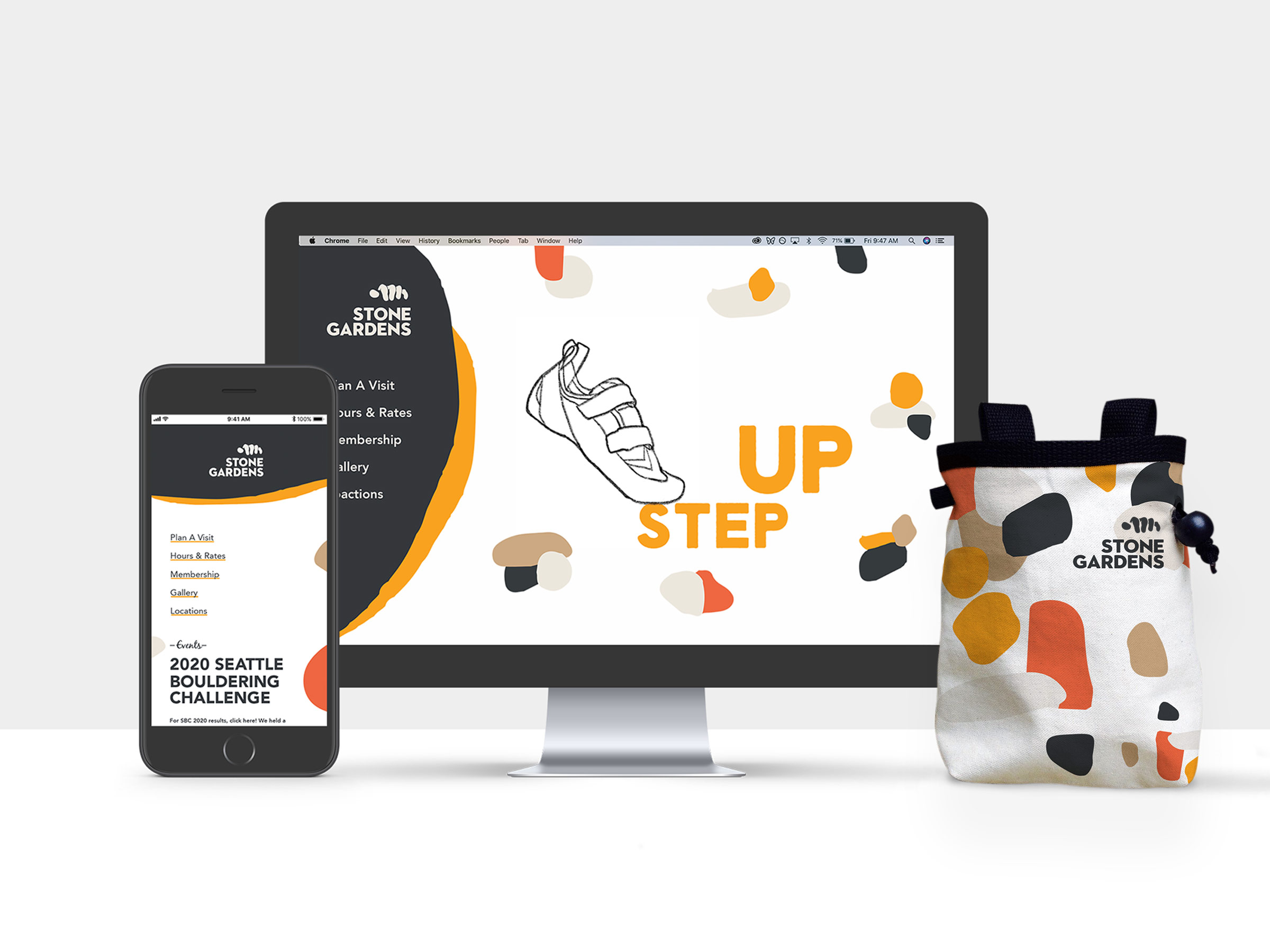
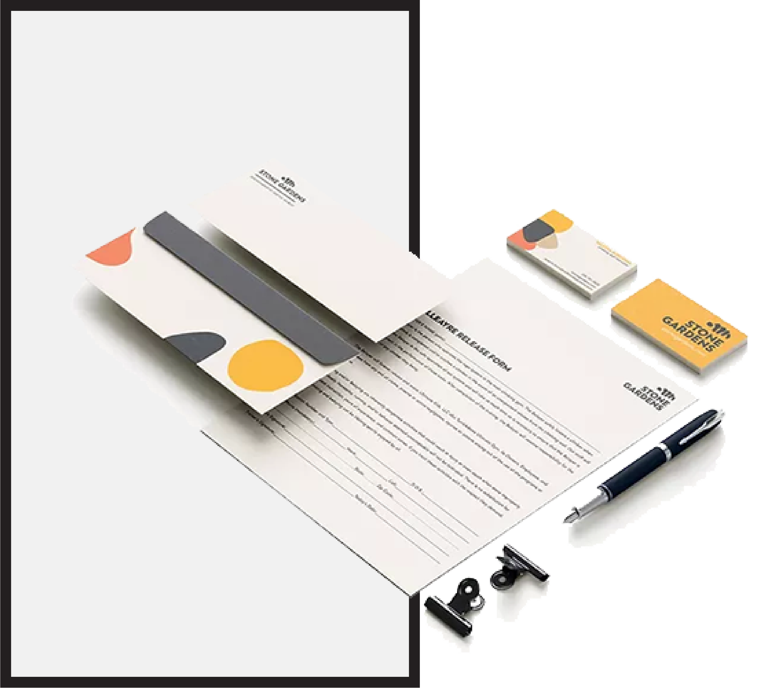
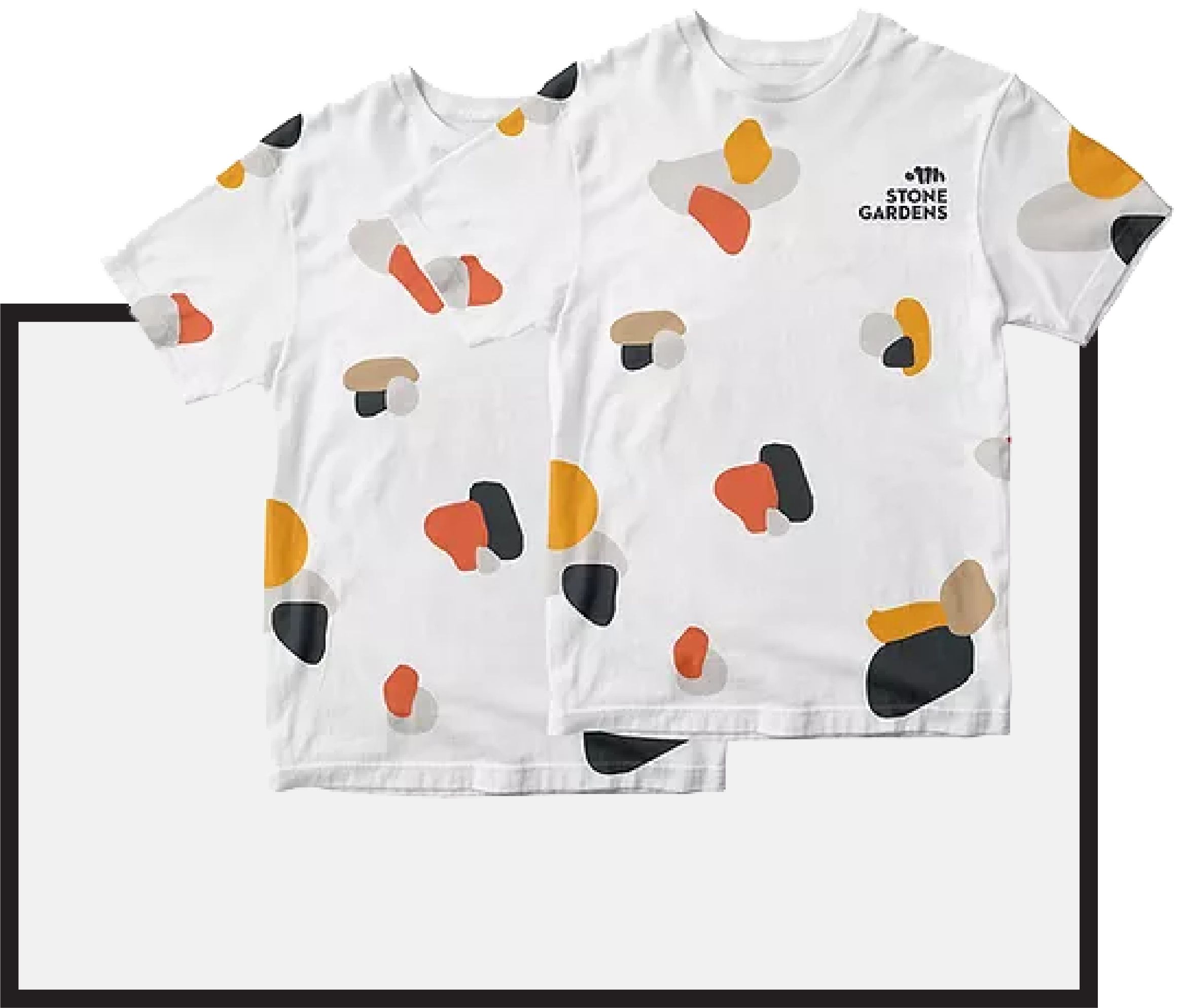
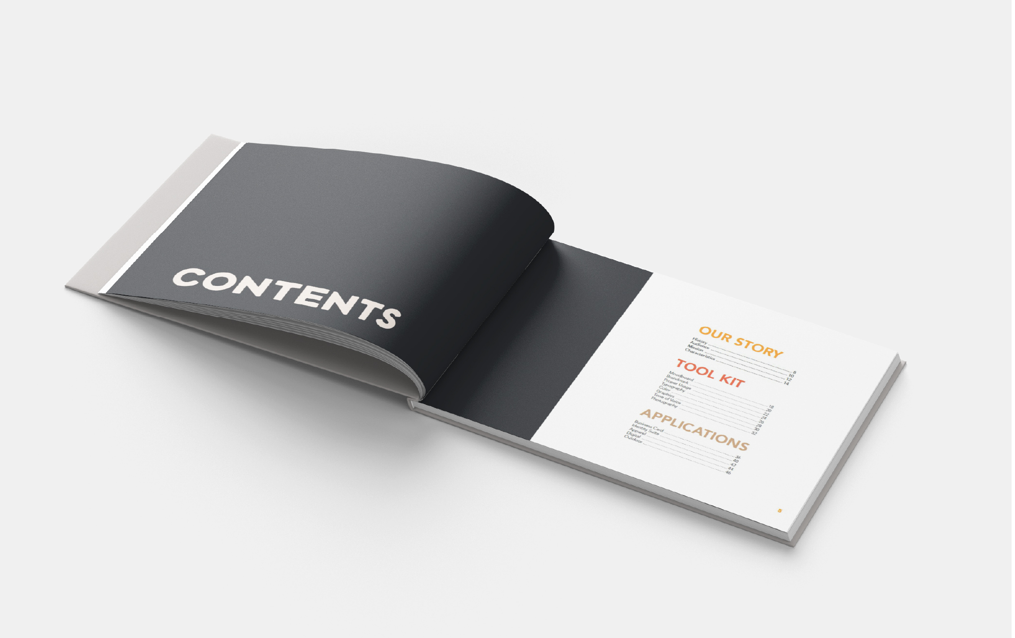
APPLICATIONS
Brand Grip Points
Whether tucked into a wallet or strapped onto a belt, the brand becomes a part of member’s lives. A range of expressive and formal styles are used depending on the application. For example, the identity suite presents a restrained brand expression, whereas the chalk bag, not so much.


BRAND BOOK
Guiding the Designer
This project culminated into a definitive Brand Guide. The goal of the book is to communicate the spirit of the business in every aspect of its design, led by our brand characteristics of Community, Alternative and Challenging.


PROCESS
Qualitative Research
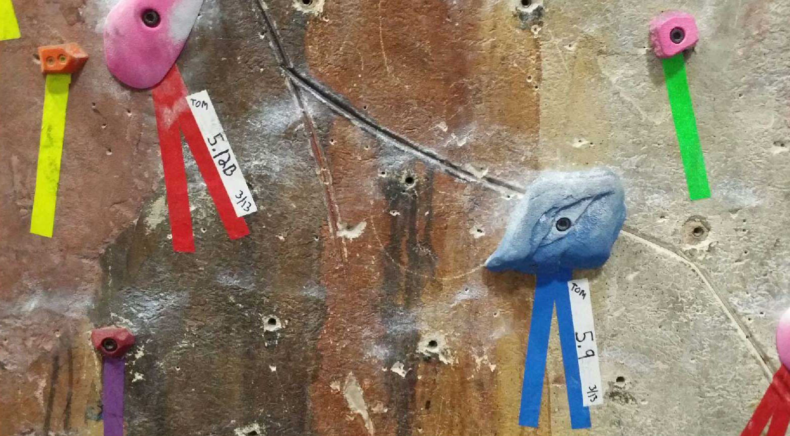
Our first move was the most obvious: Go climbing! After quickly realizing how out of shape we were, we interviewed customers and staff about what Stone Gardens meant to them. One recurring refrain that stuck with us was how proud members were that the route ratings were “not inflated.” Other gyms, we were told, inflate ratings to make climbers feel more accomplished than they are. But at Stone Gardens people love an honest challenge.
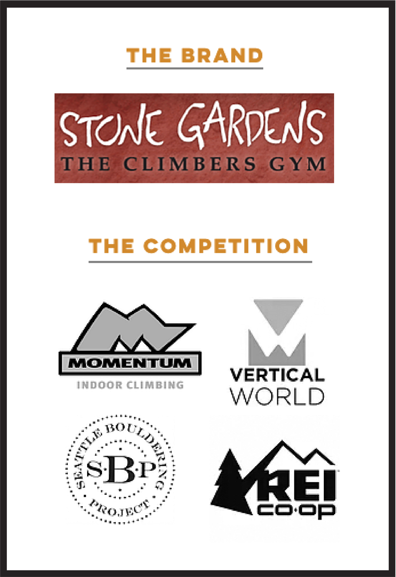
Competitive Analysis
Stone Gardens faces four primary competitors in the Seattle metro area. Relative newcomer gyms such as Seattle Bouldering Project and Momentum have carved out a chunk of the market. The oldest gym in the area, Vertical World has undergone its own modernized re-branding. We evaluated the Stone Gardens brand mark against the others and itself. We determined what was working and not working for the brand.
Working:
- Organic
- Alternative
- Tactile
Not Working:
- Legibility
- Tokenizing/Trend of the 90’s
- Poor H1/H2 agreement

Generating Brand Characteristics
With interviews of employees and patrons in hand, we generated dozens of words that decribed the gym’s brand. Three primary brand characteristics emerged with groupings beneath them.
Our brand characteristics were:
- Challenging
- Community
- Alternative
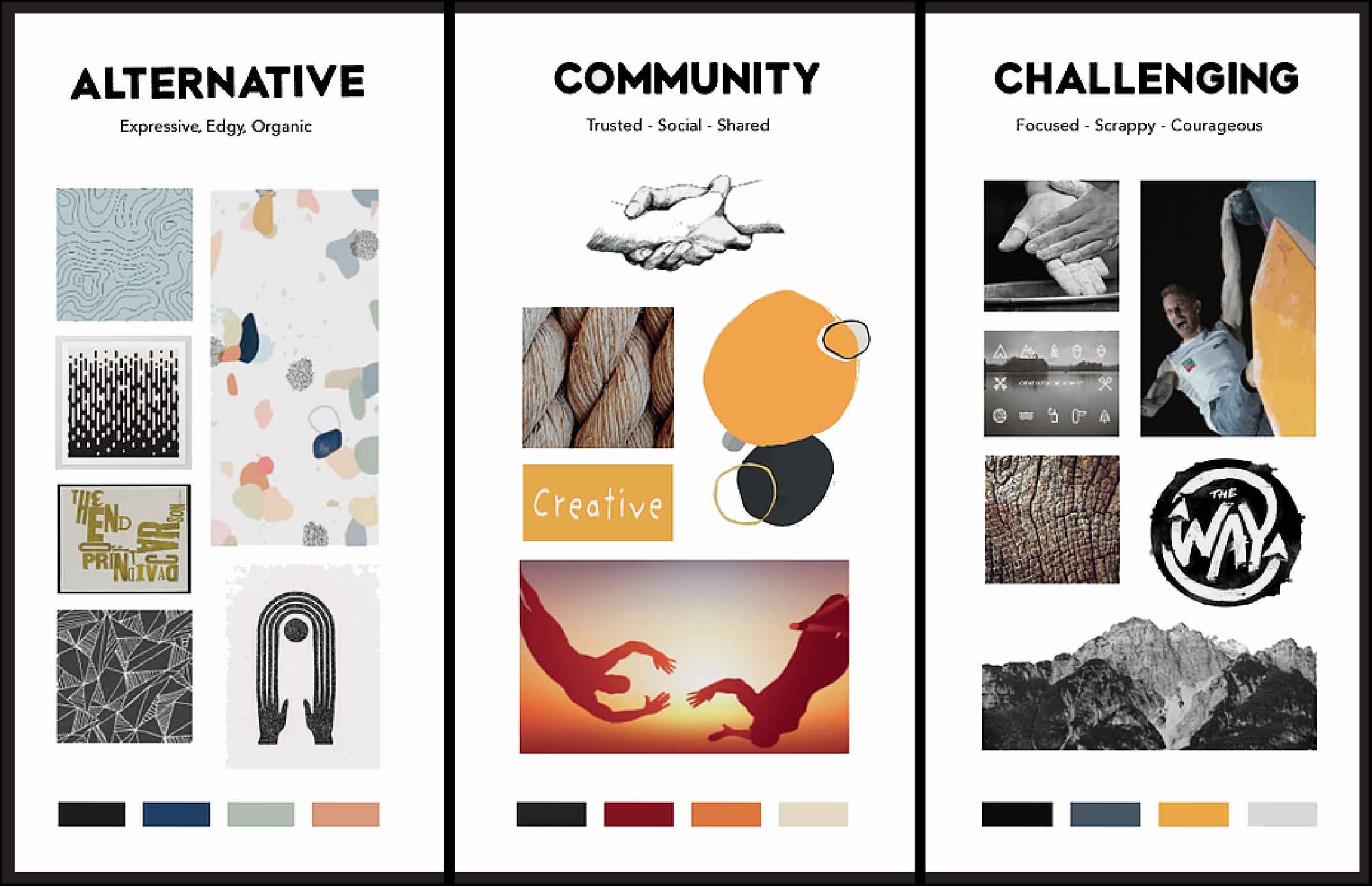
Visualizing Brand Characteristics
The visual language of each brand characteristic was explored. Observing patterns, colors and overlapping themes across our characteristics, we identified elements that reinforced one another and supported a unified brand voice.
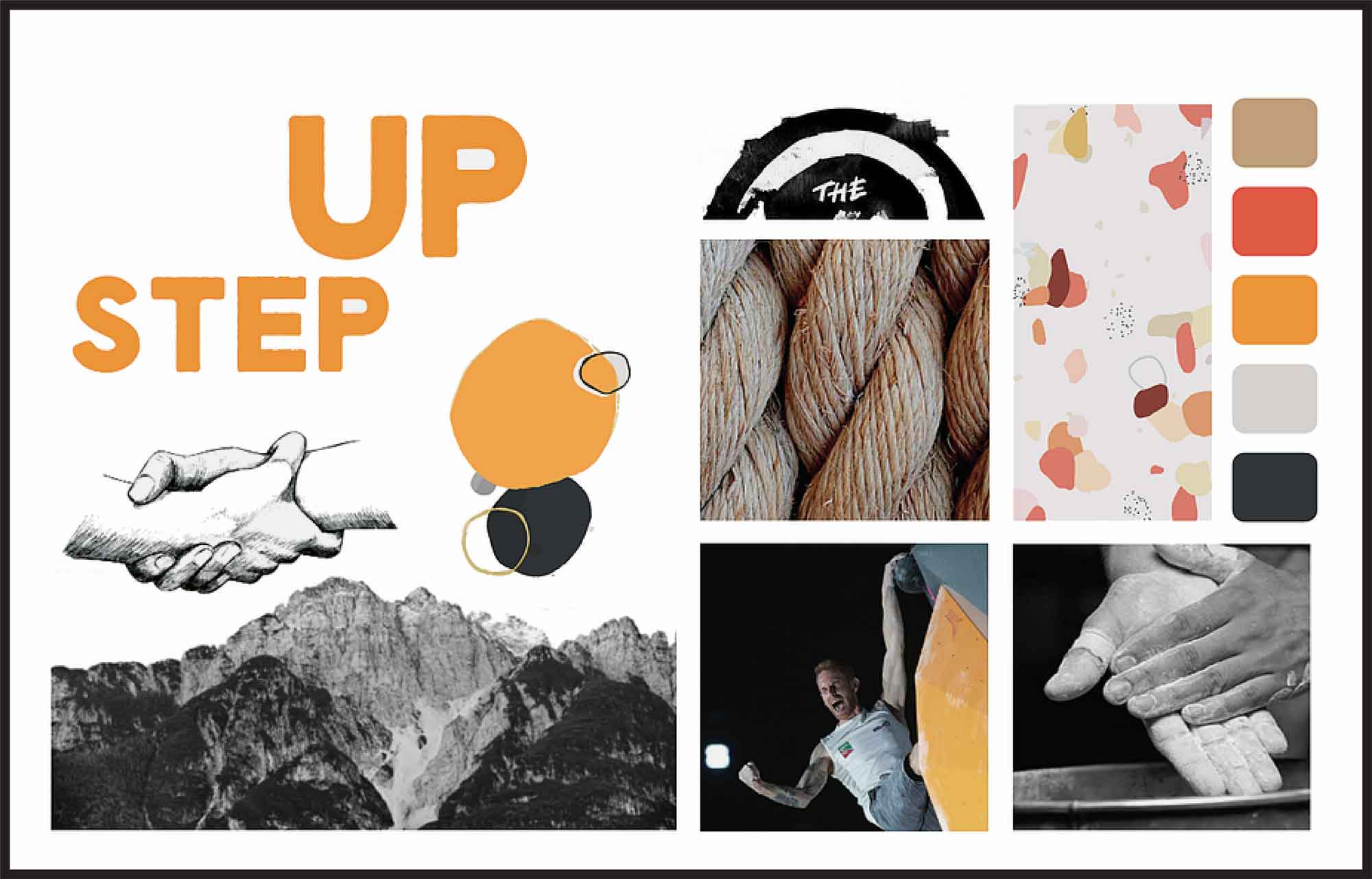
Moodboard & Insight
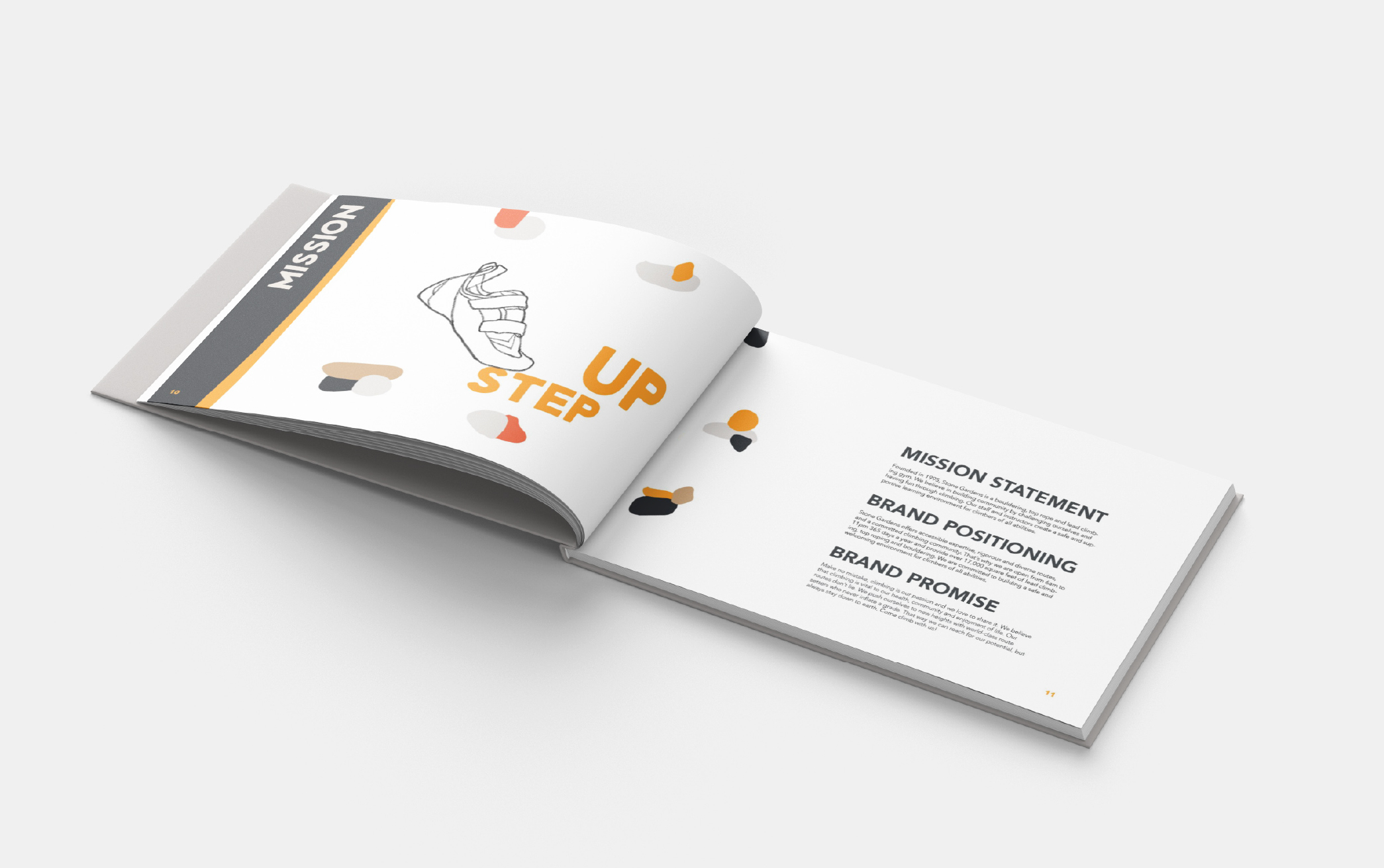
Brand characteristics were mixed into the moodboard in the proportions below. The brand is differentiated from its competitors by speaking to the community of advanced, committed climbers who are drawn to a challenge. We chose “Step Up” as our tagline to emphasize the distinct dedication to climbing within the Stone Gardens community. Organic shapes, bright, analogous colors and energized imagery reflect the no-fuss, DIY passion that we witnessed at the gym.
- 60% Challenging
- 30% Community
- 10% Alternative
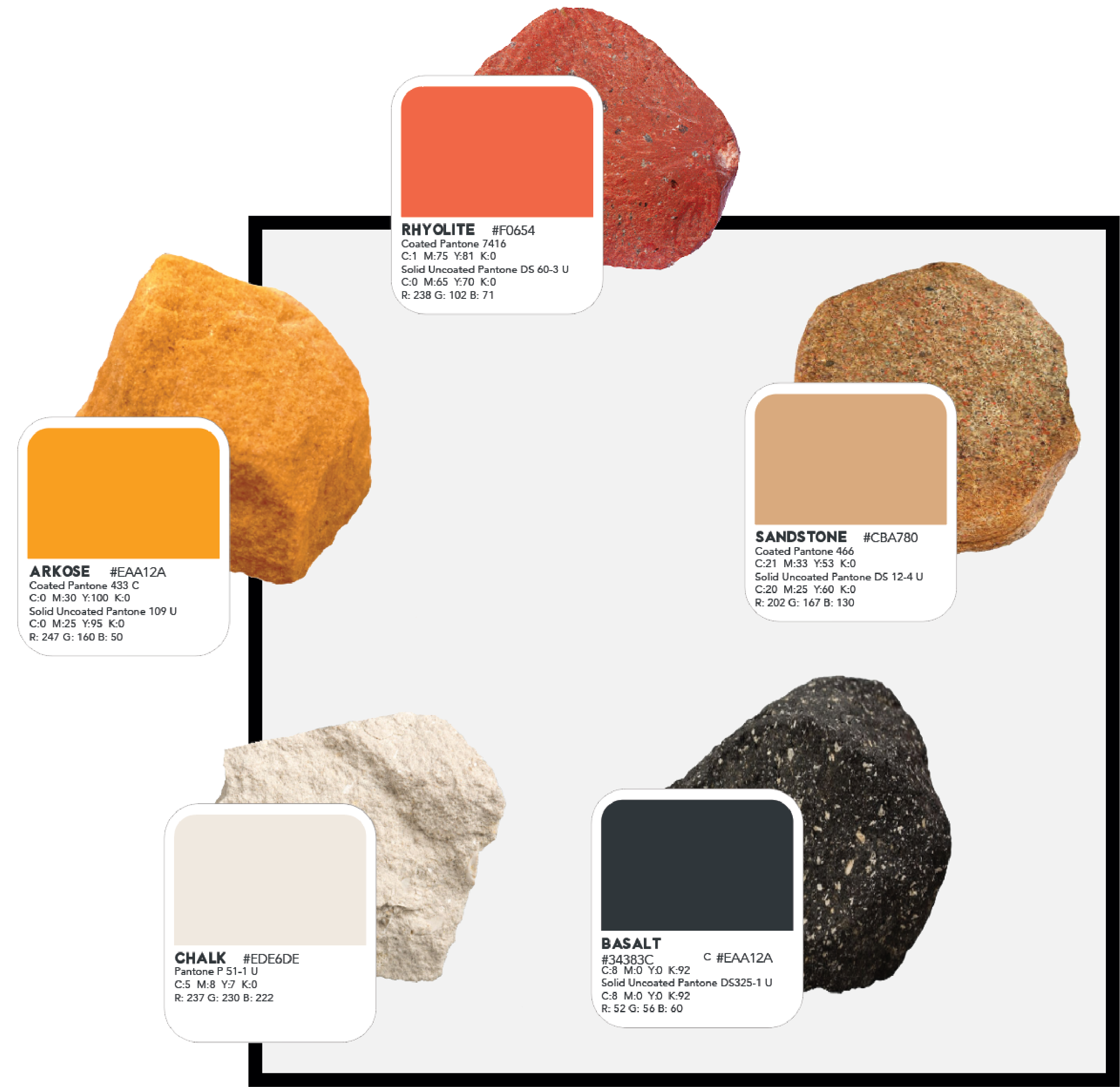
Color Palette
Vibrant, organic colors inspired by naturally occurring rocks such as Basalt, Chalk, Sandstone, Rhyolite and Arcose demonstrate the appreciation for natural environments held by the Stone Gardens community. An energetic orange and red represent an active passion for climbing, while off-white, off-black and Sandstone reflect a down-to-earth love for the outdoors.

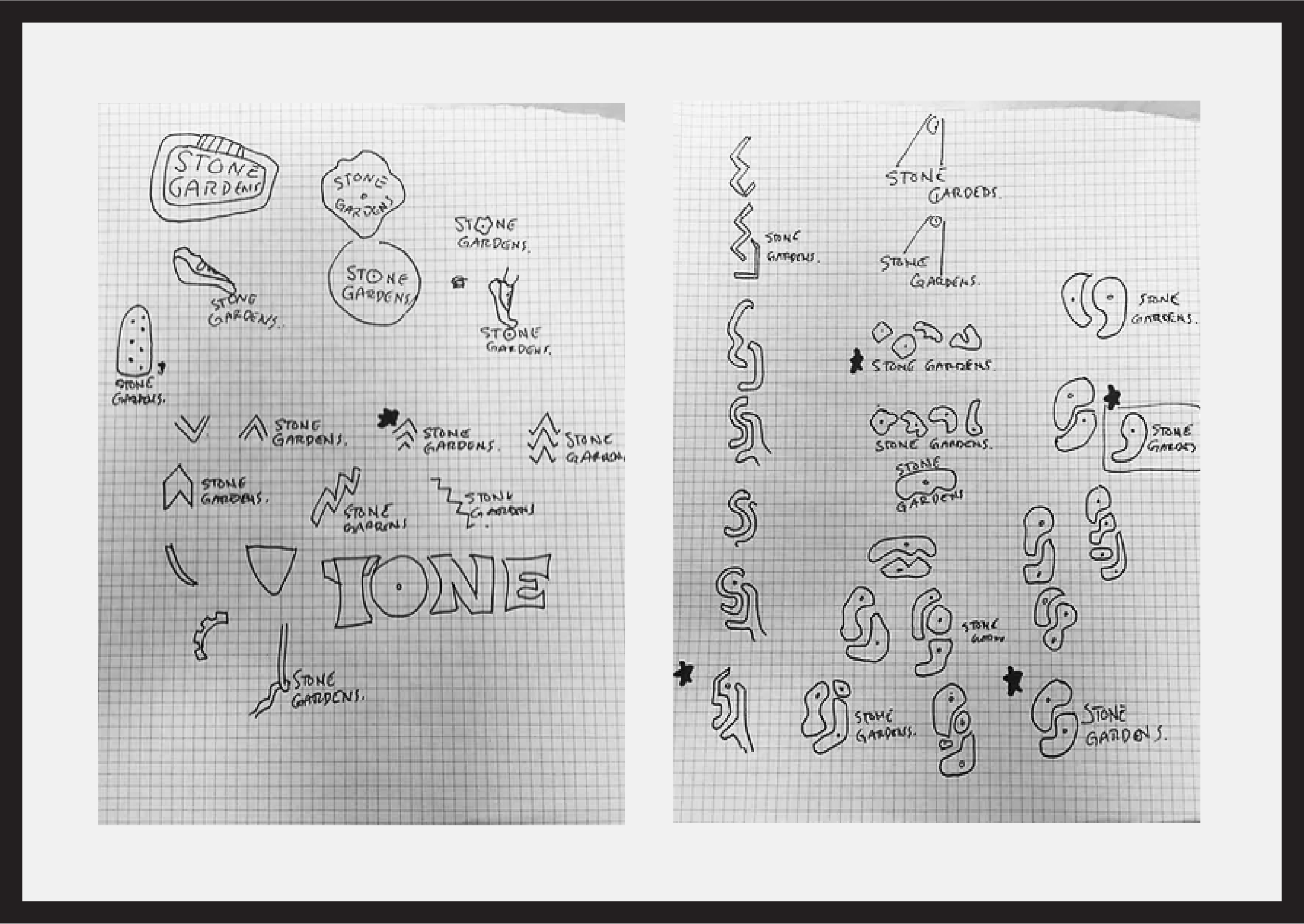
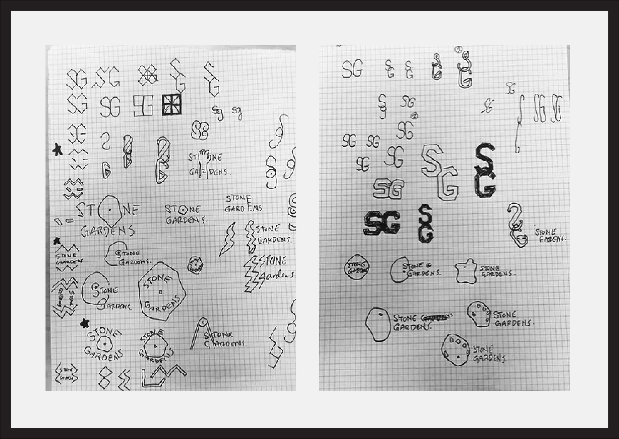
Logo Family Process
The logo presented an ongoing challenge for us as we explored easily over one-hundred different options. We’ll spare you the details. But in the end it was two small scribbles of gripping fingers that took us home. After more than two months of slogging, we arrived at our final brand mark. We are proud to say that the effort was well spent.


BRAND ASSETS
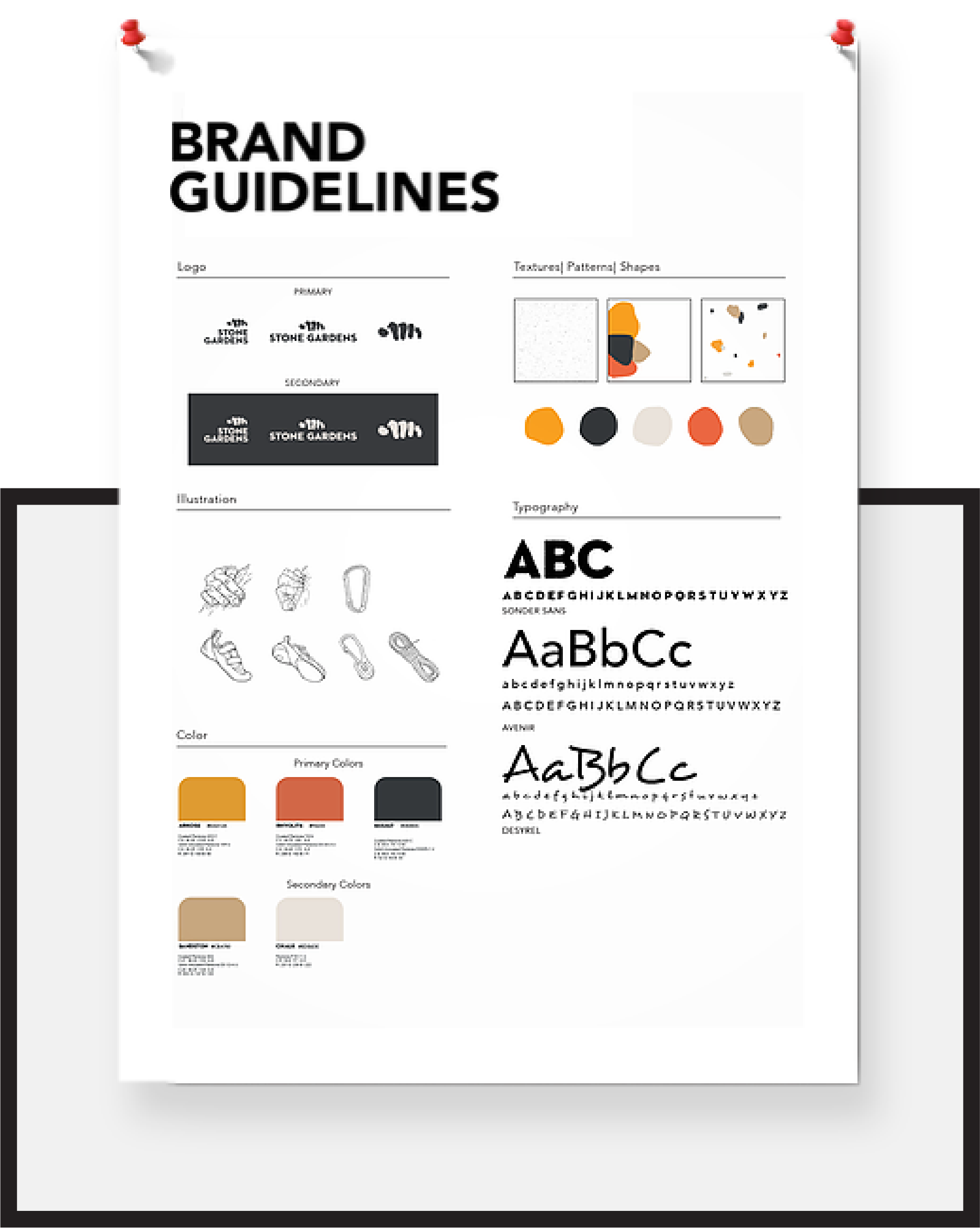
Patterns, Textures and Illustrations
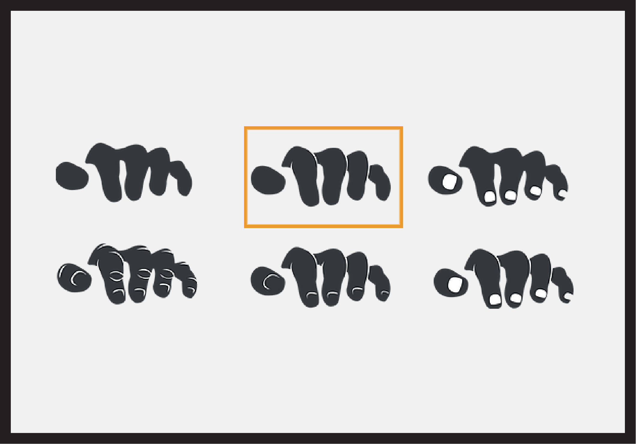
Abstracted shapes taken from the climbing wall hand-holds evolved into our pattern. Graphite contour drawings of bruised hands became web graphics. A fine, chalk-like texture brought a climbing gym feel to each deliverable. My project partner Valerie designed the rock pattern, and I made the graphic assets below.

CONCLUSION
Reflections & Acknowledgements
This project spurred significant growth and tenacity in me as a designer. It was an honor to work with my project partner, Valerie, as she contributed greatly at every stage and elevated my abilities with her own.
I learned that in order to speak clearly as a designer, one has to know what they are saying to begin with. This project came to life once we understood the true purpose behind it, which was to reflect the current community behind the brand and position Stone Gardens as the gym of experience, dedication and fun. I believe we succeeded in that endevour.