New Start Community Garden
TEAM
Independant
Independant
ROLE
Branding
Art Direction
Visual Design
Art Direction
Visual Design
TOOLS
Illustrator
Photoshop
Indesign
Photoshop
Indesign
TIMELINE
12 Weeks

Challenge
The New Start Community Garden was built in 2018 by community members and high school students in an unused baseball field across from their school. Signage describing the various functions of the garden was wanted for future generations of students, gardeners and visitors alike.
Solution
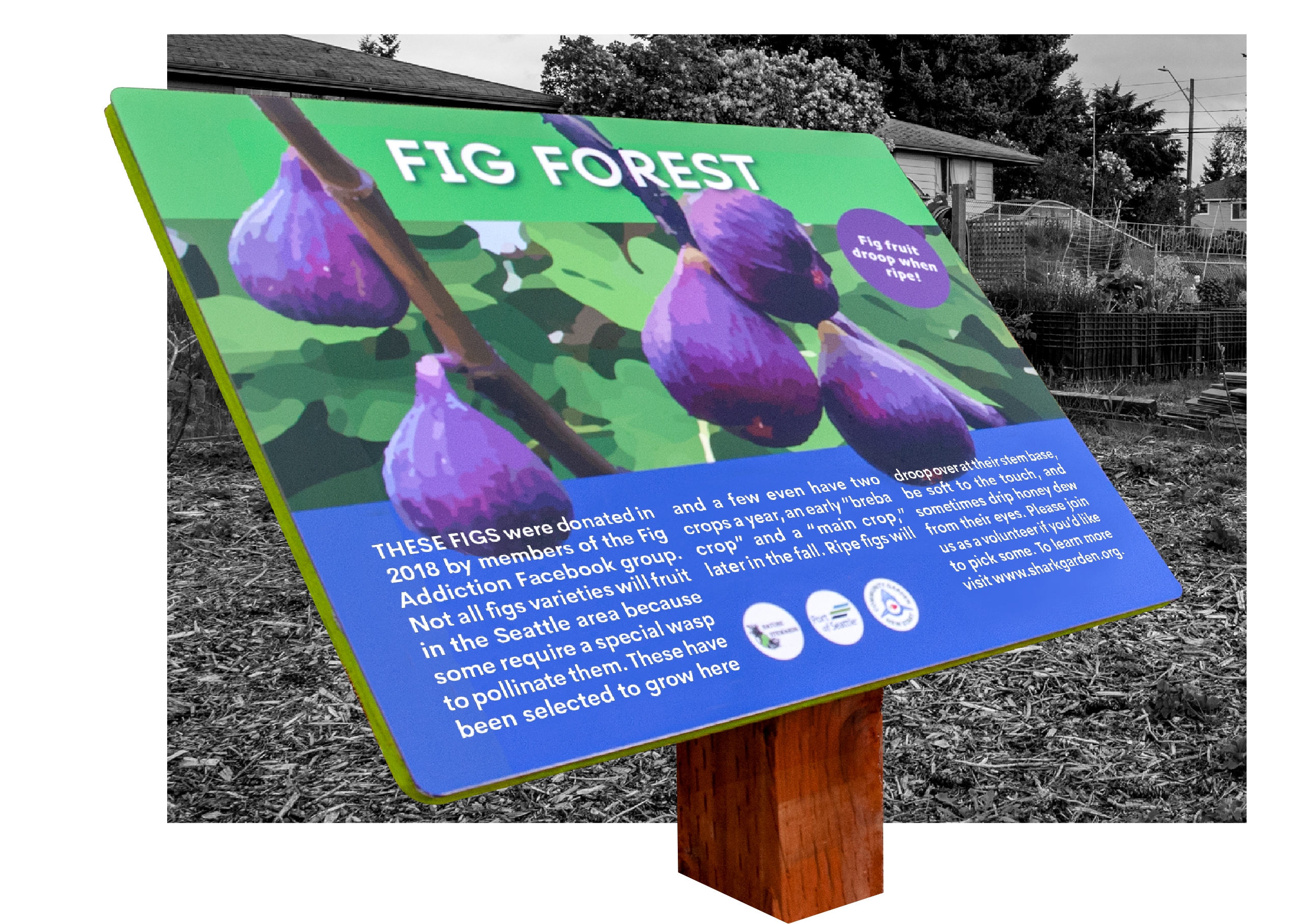
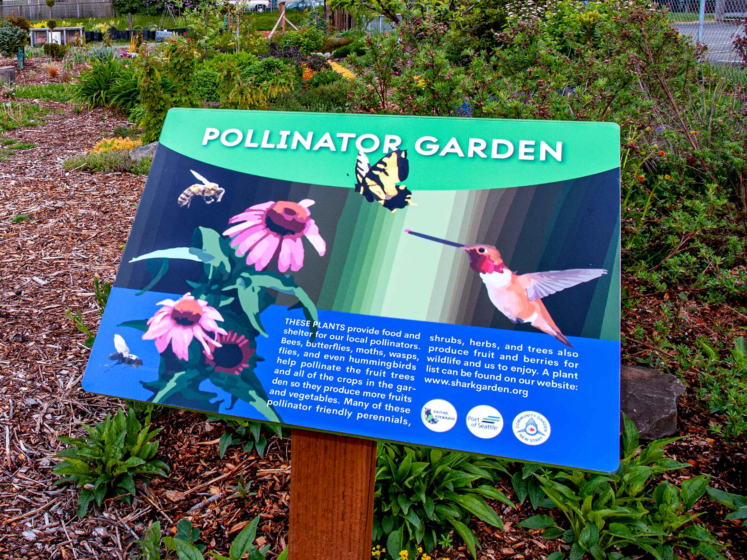
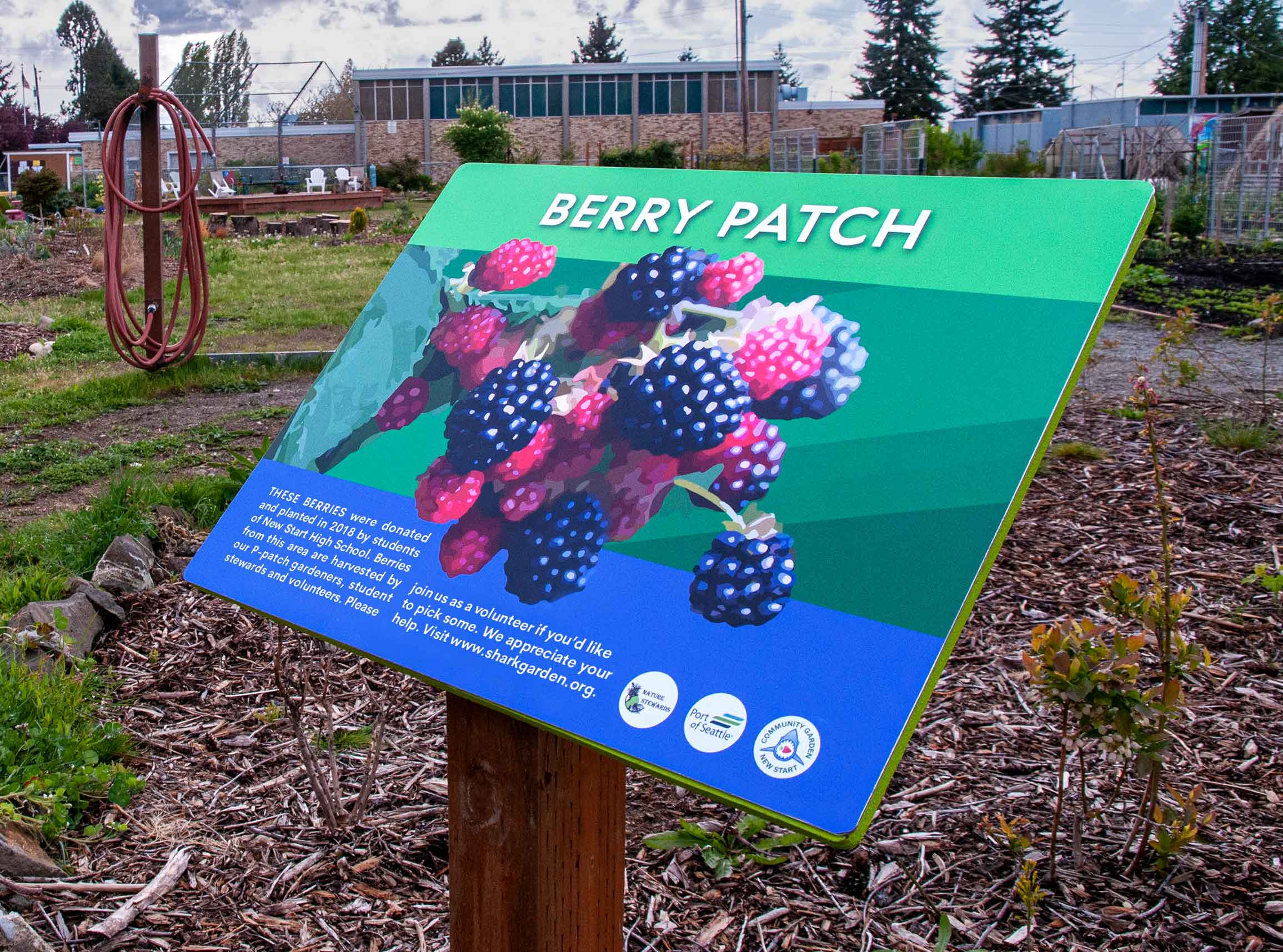
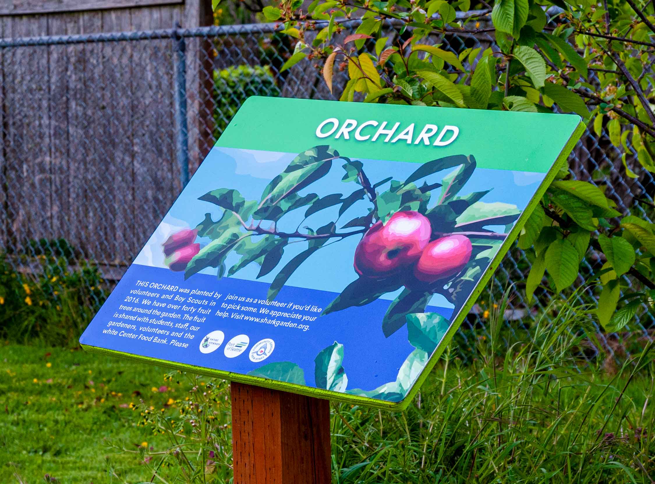
A local non-profit, Nature Warriors, commissioned the design of eight signs and installed them around the garden. With lush colors and tempting fruits and flowers, the signs serve as reminders of the garden’s splendor during dreary months. The signs prioritized conveying their informational text by utilizing a strict and unified design system.
APPLICATIONS
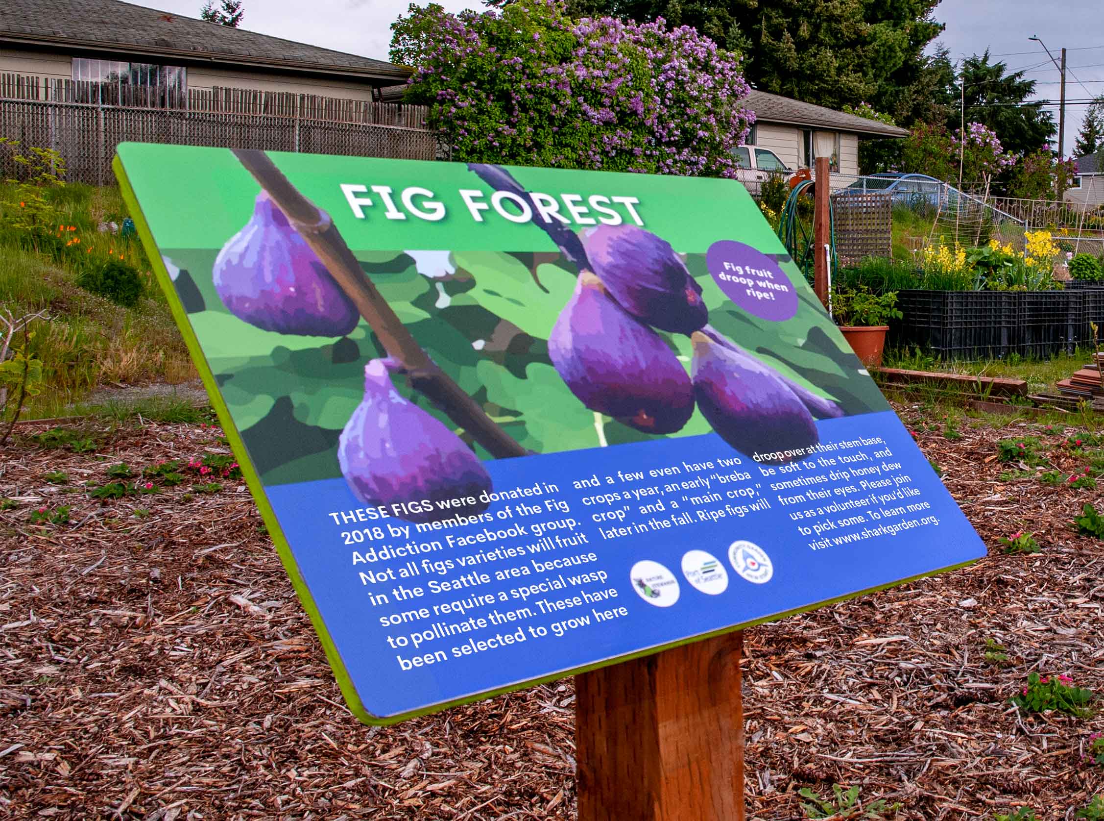
Signs Installed
On April 10th, 2020, the signs were installed in the garden. I was thrilled to see my work in the environment they were designed for. New Start High students and community members alike enjoy them, I am told.

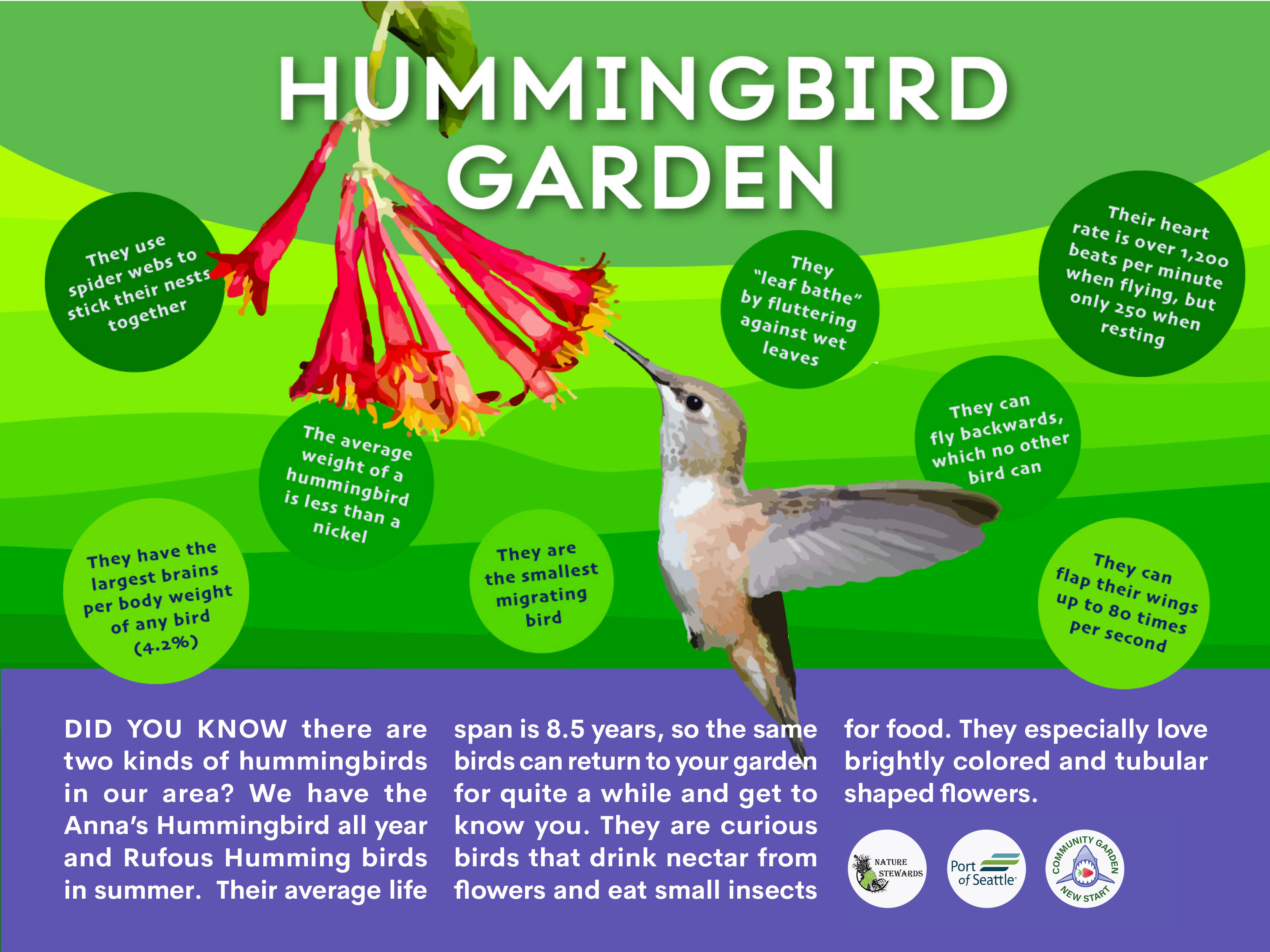
Signs To Be Installed
Below are signs in line to be installed in the garden. The client has expressed an interest in new and diverse sign styles. As you can see, the list is growning fast!


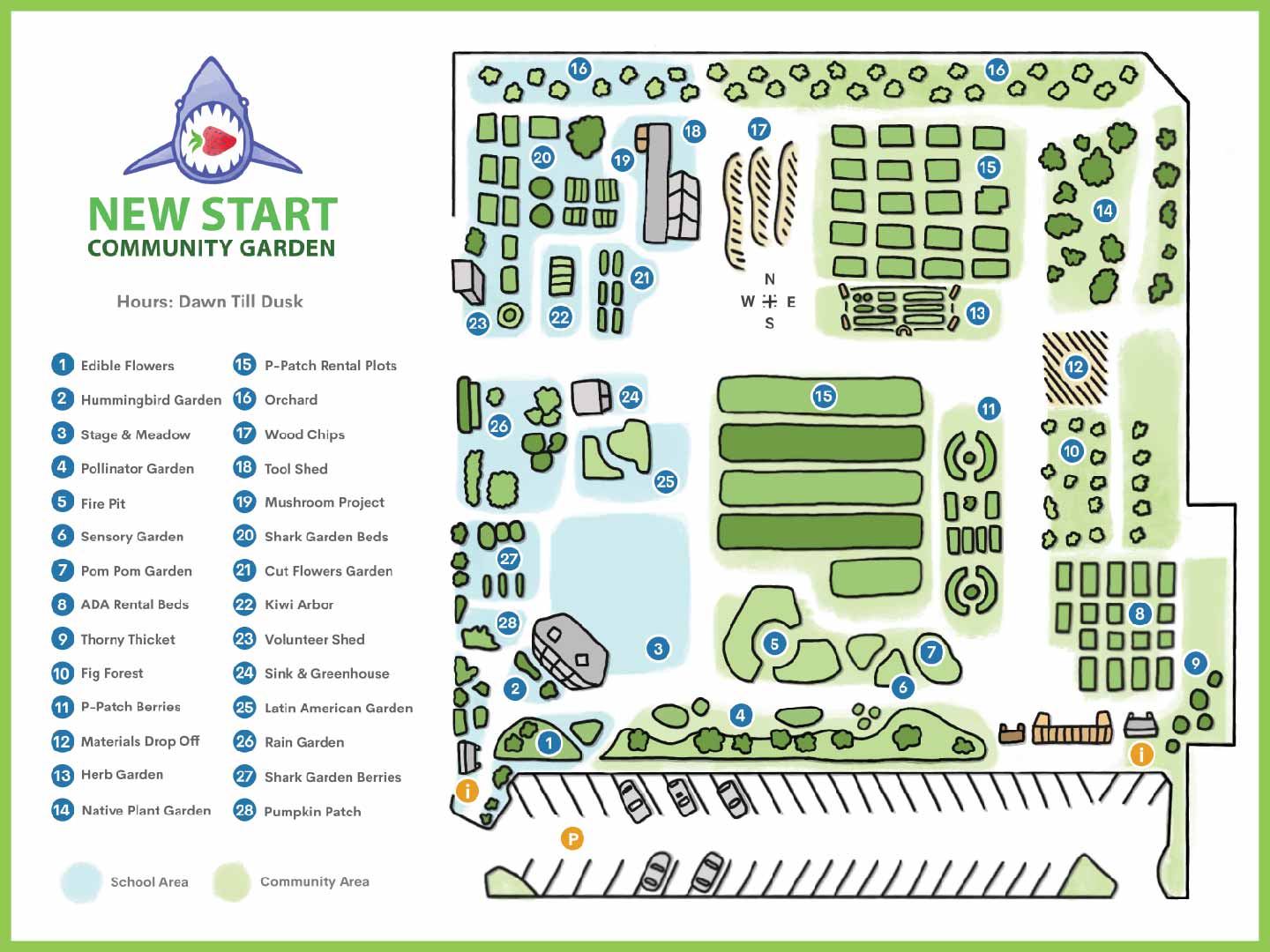
Garden Map
I created a detailed, hand-designed map of the 1.6-acre Shark Garden at New Start High School, illustrating its full scope and community impact. The map highlights all 28 sections of the garden, carefully labeled and color-coded to show shared use between the high school and the surrounding community. This visual tool makes the garden’s layout clear and accessible, celebrating its dual role as both an educational resource and a neighborhood gathering place.
IDENTITY
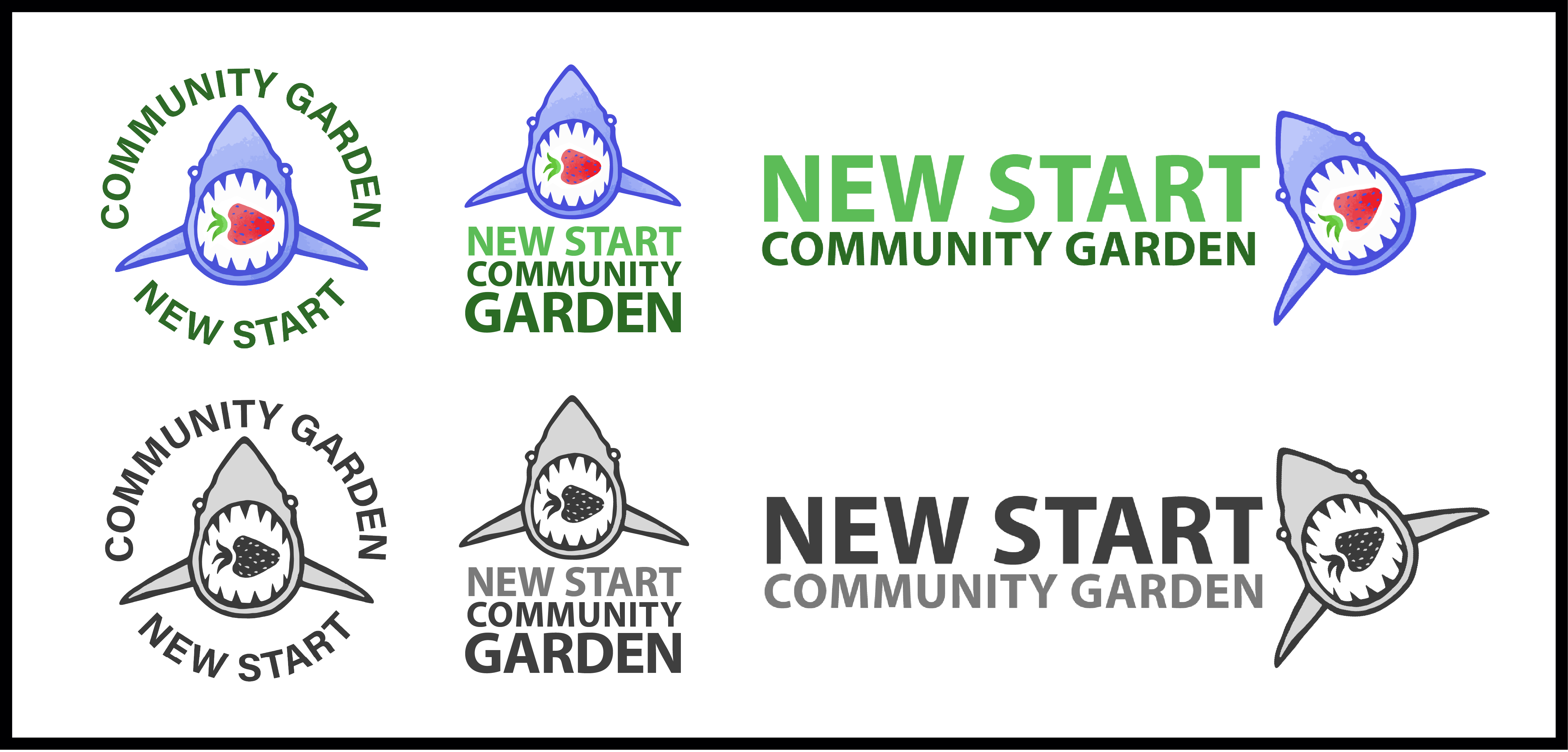
Logo System
The logo design brief was straight forward: a shark eating a carrot or strawberry. However, arriving at a simplified, logo-like version of those things proved to be a challenge. After many iterations (a portion of them are shown left) we arrived at a solution which was more illustrative and organic than the typical logo. However, these qualities reflect the natural environment and youthful exhuberence of the garden.

PROCESS

Inspiration
Students of New Start High School had already painted some signage of their own. These student’s were my sign’s primary audience I looked for ways to incorporate their aesthetic into the work. I aimed to give them a sense of ownership of the garden that they had helped build. The graffiti mural, right, served as inspiration for multiple iterations below.
Iterations
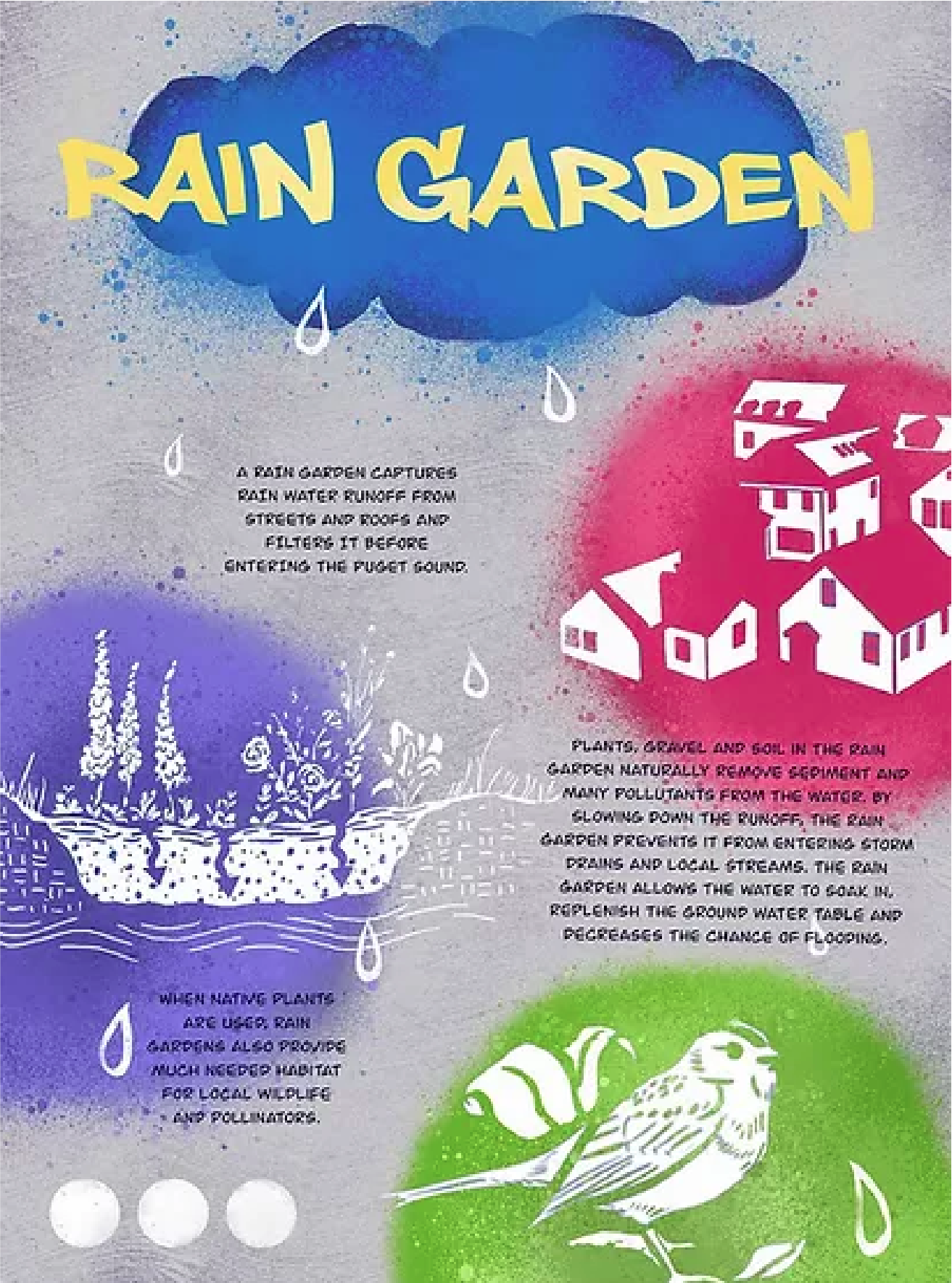
Inspired by the student's art, I pursued pop-art and graffiti graphic styles with the aim of creating signs that would designate the garden as a student-owned space. But these attempts were rejected by the client on account of (very legitimate) legibility issues.


Insight
With the client’s previous rejections and feedback in mind, I switched gears and moved away from the graffiti graphics. Instead I prioritized a clear informational hierarchy, reading accessibility as well as a templatization and unification of the signs’ structure. I preserved the original mural’s color palette as well as some floral design elements, but used a paper-cut out style that echoed other graphic styles of New Start high school. With the client’s approval we charged ahead.
CONCLUSION
Reflections
As my first significant client project there was a steep learning curve in presenting material and communicating with the client. I learned the value of simple sketches to communicate big ideas rather than a series of high-res options. I’m proud of the relationship generated with Nature Warriors, the sponsoring non-profit.