Nordstrom Anniversery Sale
TEAM
Independant
Independant
ROLE
Concept
Art Direction
Production
Concept
Art Direction
Production
TOOLS
Illustrator
Photoshop
Procreate
Illustrator
Photoshop
Procreate
TIMELINE
4 Weeks
4 Weeks

Challenge
In any normal year, the Nordstrom Anniversary Sale aims to elevate sales during July and August, predictably slow months for retail clothing. In 2021, the Summer Sale has a new objective of re-establishing the brand as the destination for in-person retail shopping. This Summer, stir-crazy quarantined shoppers are expected to make a strong comeback from the pandemic recession. This presents an opportunity and a challenge for Nordstrom to ride a potential wave of spending by people looking to enjoy some of their substantial pandemic savings.
Solution
Collectively we are craving community, in-person activities and a sense of positive normalcy. By connecting with the emotional needs for comfort, company and optimism of post-pandemic shoppers, Nordstrom has an enormous opportunity to energize and provide for its loyal customer base. The 2021 Anniversary Sale offers an iconic summer experience of fashion, fun and friends, finally.
APPLICATIONS
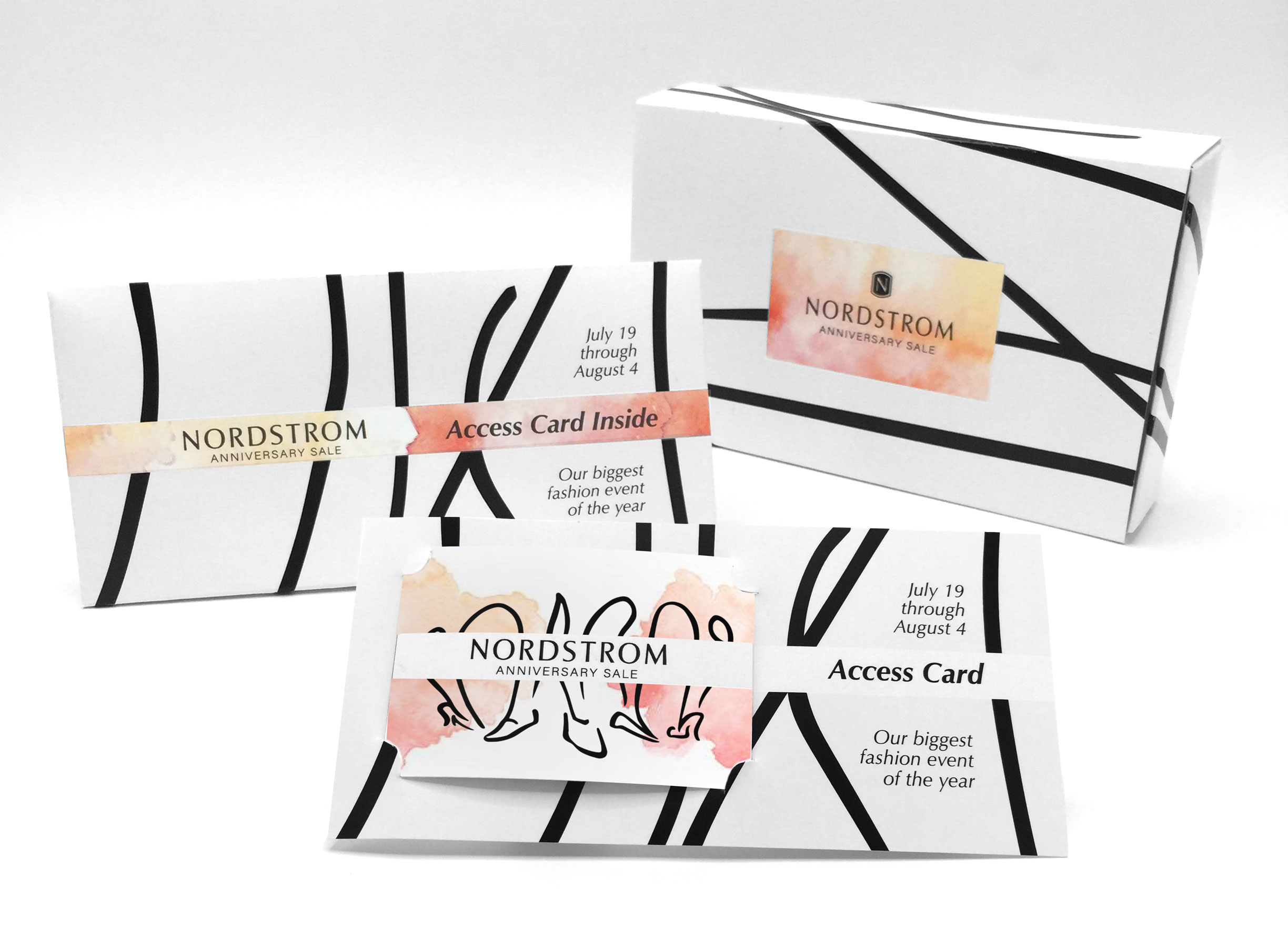
Delivered Assets
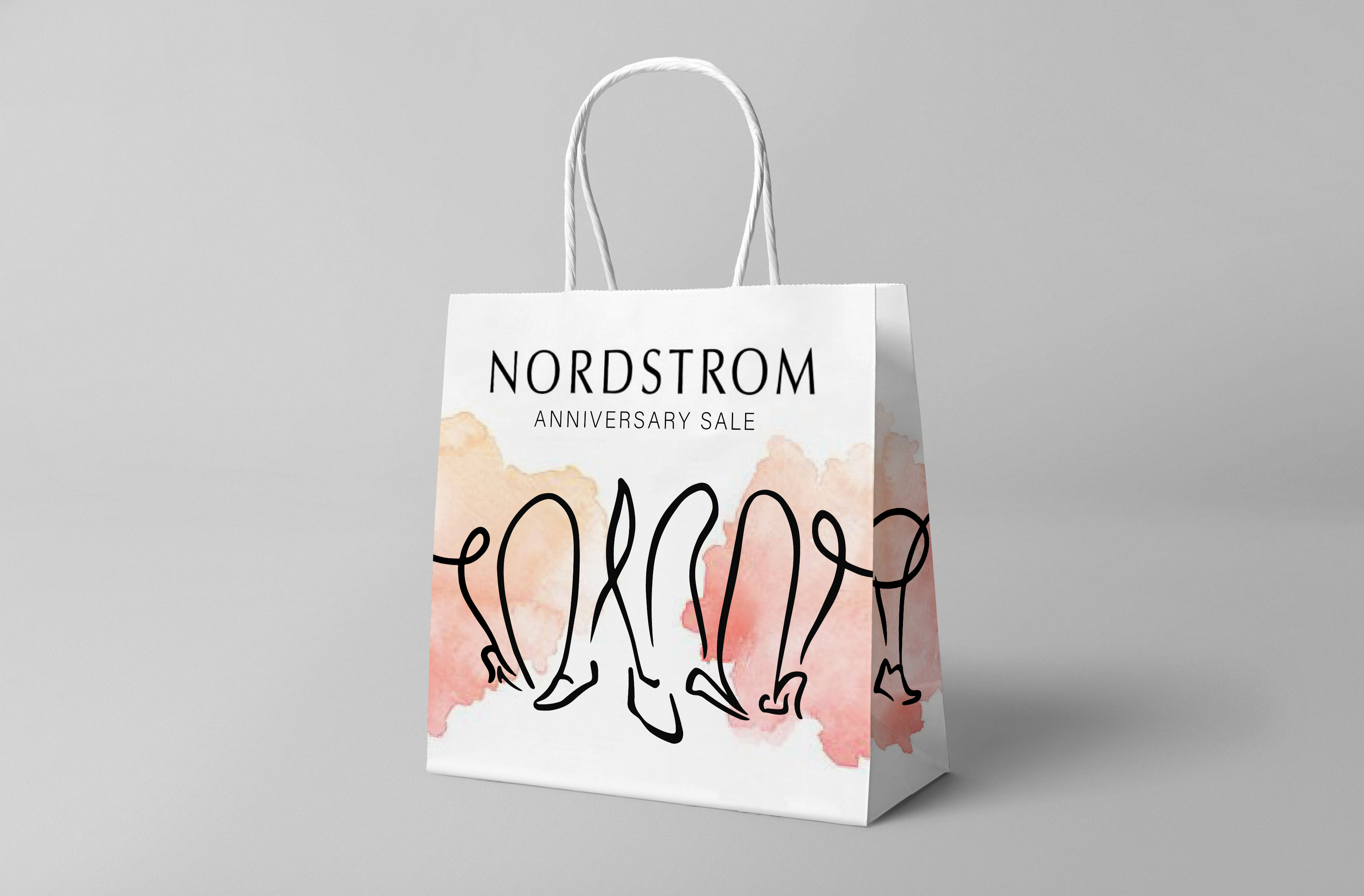
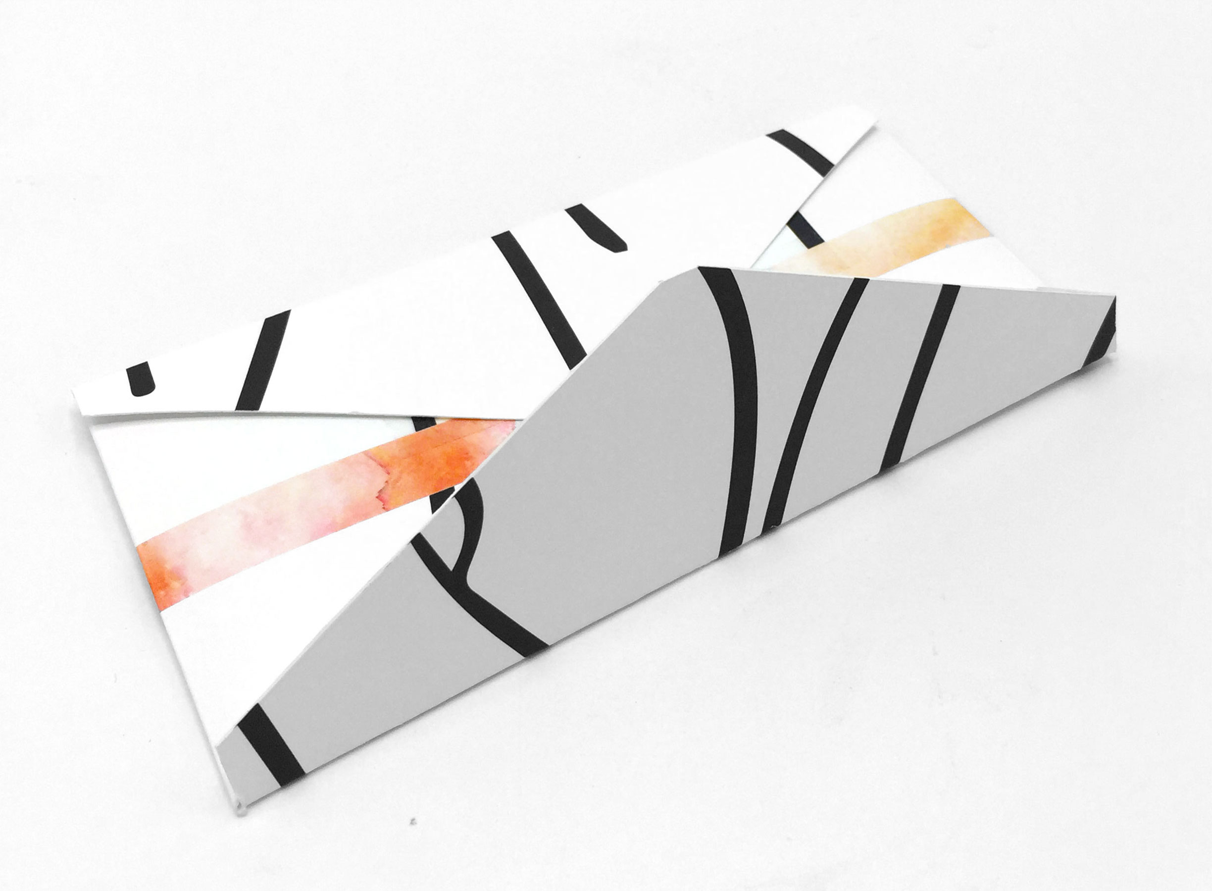
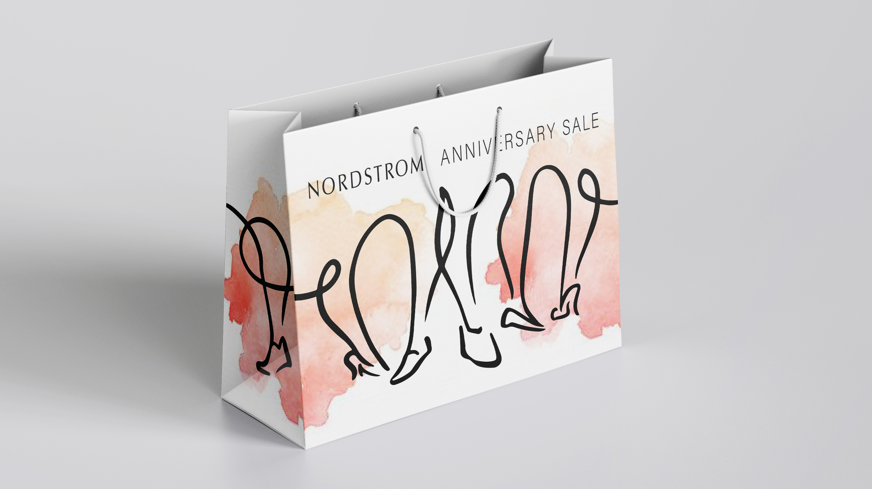
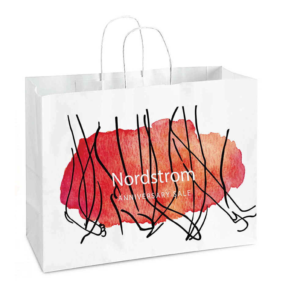
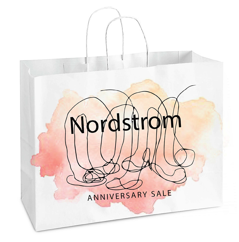
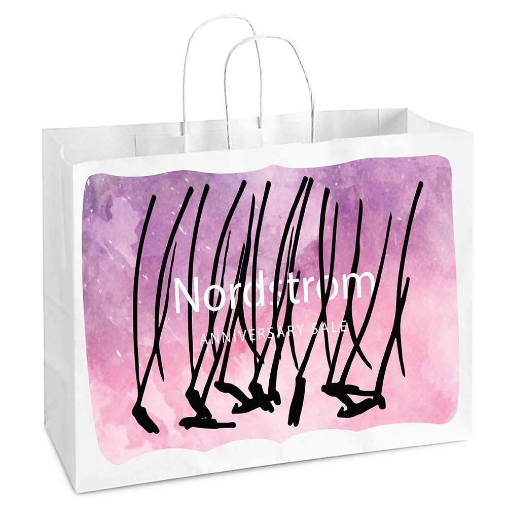
Providing a simultaneously (and perhaps paradoxically) fresh and familiar feel, this Anniversary Sale brand uses abundant white space, abstracted zebra stripes and summery fields of color that call back to a 1950’s modernism. The flowing legs and feet of friends shopping for shoes (an impulse buy of the ages) illustrate joyful companionship. With the aim of celebrating offline and in-person connection, these deliverables offer tangible experiences that signal a return to much needed normalcy.


PROCESS
Moodboard
Drawing from the timeless and classic design of Vogue and Harpers, as well as from the hand-touched feel of flowing contour drawings, this brand speaks with enthusiasm and refinement. Black, white and pops of warm color communicate joyful energy, optimism and tactile togetherness.


Concept
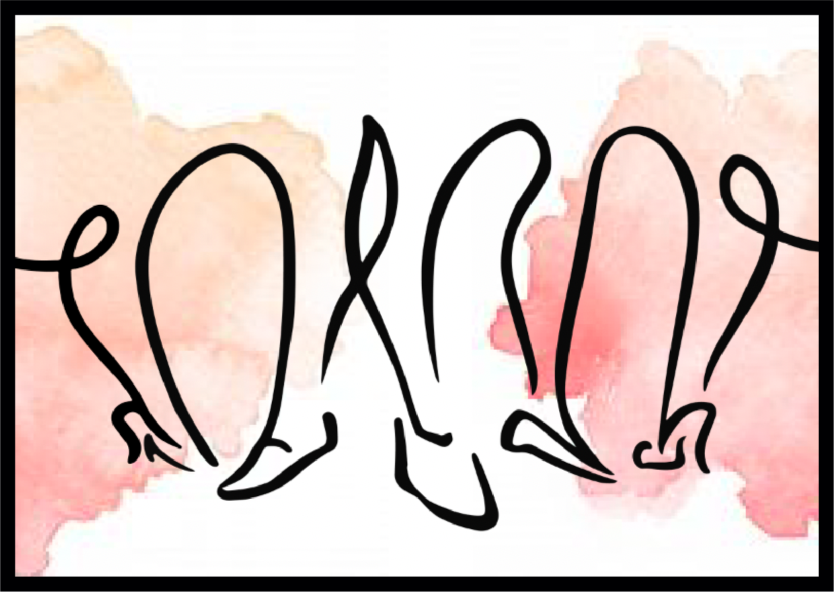
My first sketch aimed to illustrate the simple but profoundly missed experience of shopping with friends. By focusing on an abstractly connected collection of shins and shoes, an inclusive invitation to be close, connected and fashionable is made.
Iterations
I explored multiple versions of bright color fields layered under bold and abstract contour illustrations. However, my initial sketch seemed to convey a unique sense of human closeness that was difficult to replicate. After many attempts, the final forms took shape.

Insight
A stylistic breakthrough occurred when I gave the shoes a less abstract (if sloppy) treatment. I continued the concept from a previous iteration (above) of connecting the legs at the knee in order to drive home the idea of a tactile, touching, social connectedness. I used the watercolor blotch that felt most “Summery” to fit the season of the sale, but broke it up to create a more dynamic, wrap-around design.
CONCLUSION
Reflections & Acknowledgements
This project could not have happened without the instruction and support of my professor and Modern Dog Design CEO, Robynne Raye. From her and through this project I learned about the importance of enjoying the creative process, and that the quality of work rises when fun is had. This project remains a favorite of mine from the Seattle Central Creative Academy. Thank you, Robynne!