SilverKite Community Arts Rebrand
TEAM
Independant
Independant
ROLE
Branding
Art Direction
Branding
Art Direction
TOOLS
Illustrator
Photoshop
After Effects
Miro
Illustrator
Photoshop
After Effects
Miro
TIMELINE
10 Weeks
10 Weeks

Challenge
Founded in 2015, SilverKite Community Arts provides arts workshops to organizations around the Puget Sound Region. Founder and CEO, Jen Kulik, was looking to refresh the brand and better visually demonstrate the company’s values. She wanted to the brand to reflect what the business had grown into since its founding. She thought that the old logo, left, felt too cold and too busy.

Solution
Artistic, Belonging, Friendly and Professional were brand adjectives that guided this rebrand. In order to express these brand values, we emphasized the people who are served by Silverkite as well as the colorful, artistic context that connects them. After many versions, we landed on an approachable and professional brand that reflected the warmth and artistic flair of the mission and community it serves.
APPLICATIONS
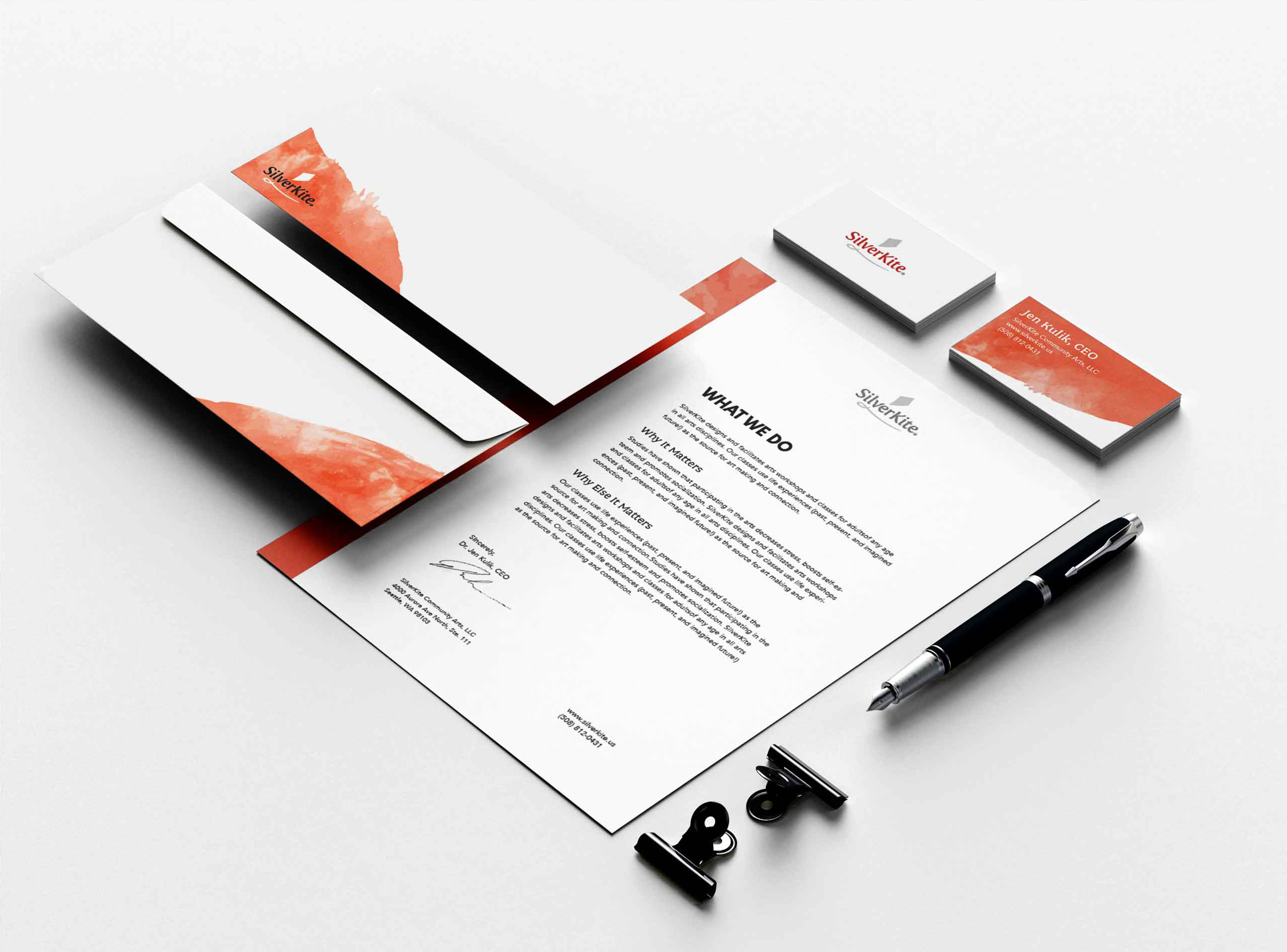
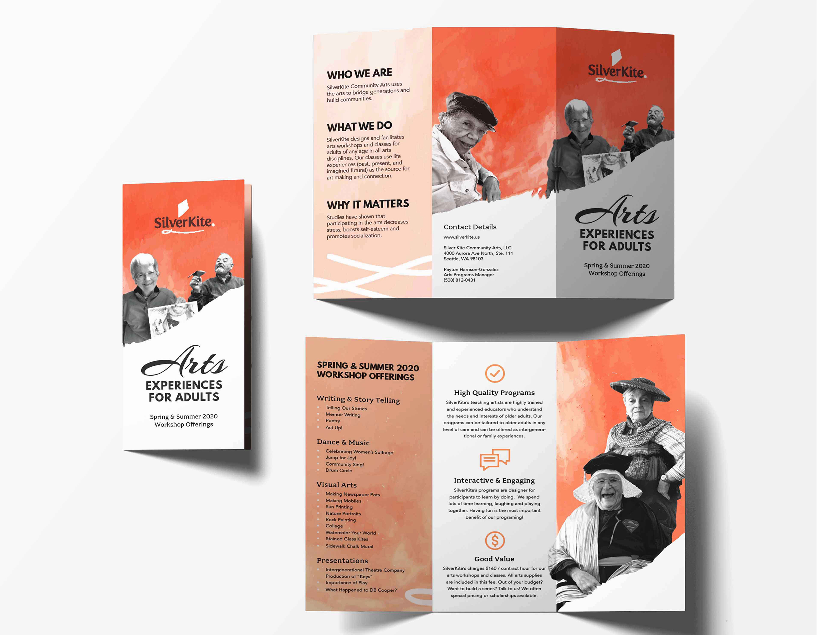
Delivered Assets
Newsletter and social media templates as well as web graphics and a facebook ad were the primary digital deliverables. Assets were templatized and uploaded to Canva and Mailchimp, the client’s social media and newsletter creation hubs. An identity suite, trifold, lanyard and t-shirts were the primary print deliverables. A unique, consistent and personable brand was born.


PROCESS

Competitive Analysis
Competition for SilverKite is mostly comprised of Senior Care organizations that are tied to particular institutions and senior care providers. Branding ranges from highly restrained to highly expressive. We sought to strike a balance between the creativity and community SilverKite offers as well as its commitment to reliability and excellence.
Brainstorming the Brand
To understand the brand look and feel, I conducted an image sorting exercise with the client. She arranged over 100 images into categories of on-brand, off-brand or somewhere in the middle. The small pile of on-brand images led the way in creating visual explorations of the brand values.
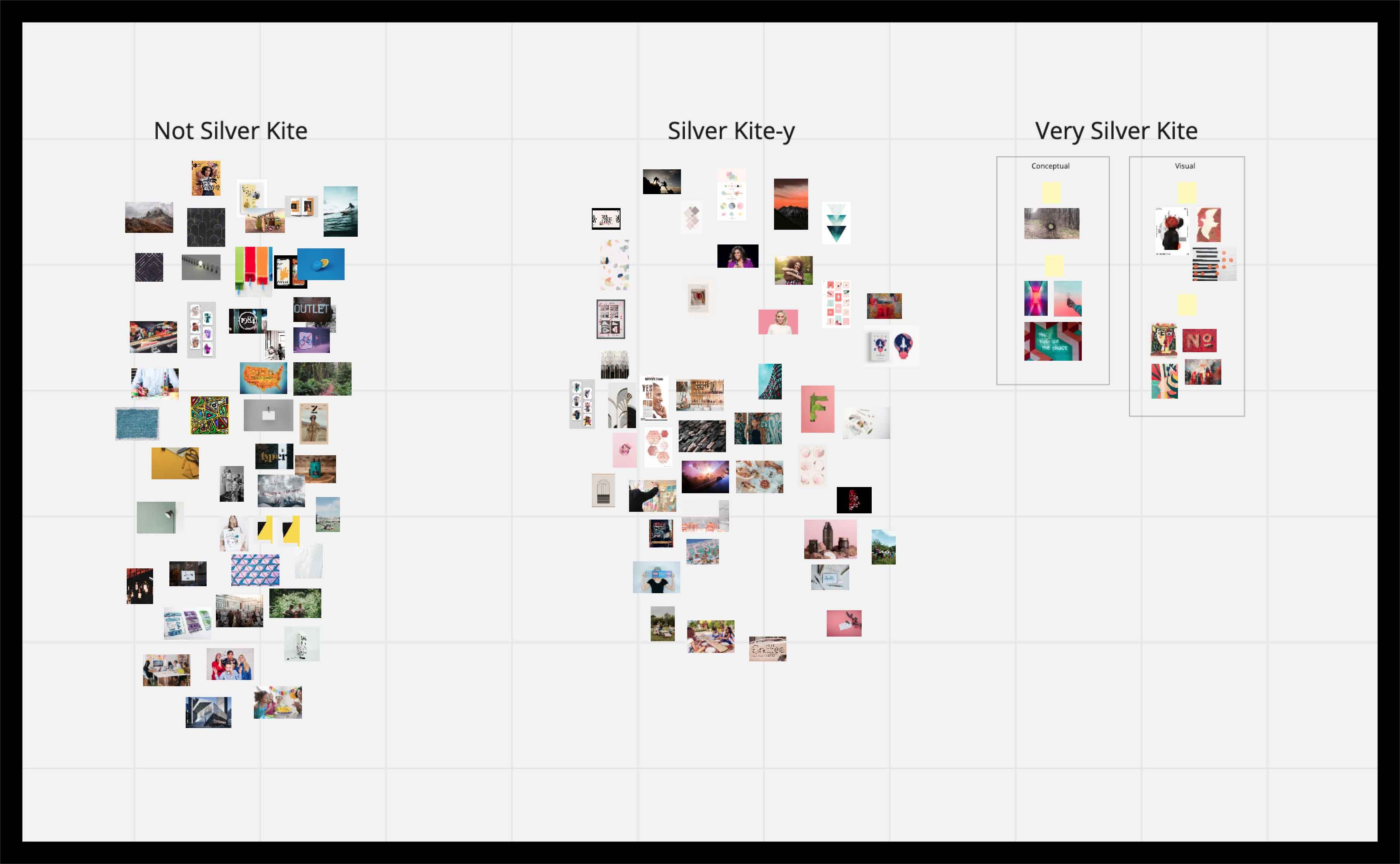

Brand Characteristics
Each brand characteristic was visually expressed using the “on-brand” images from the image sorting exercise as a starting place. The characteristics were as follows.
- Artistic
- Belonging
- Professional
- Friendly
Moodboard
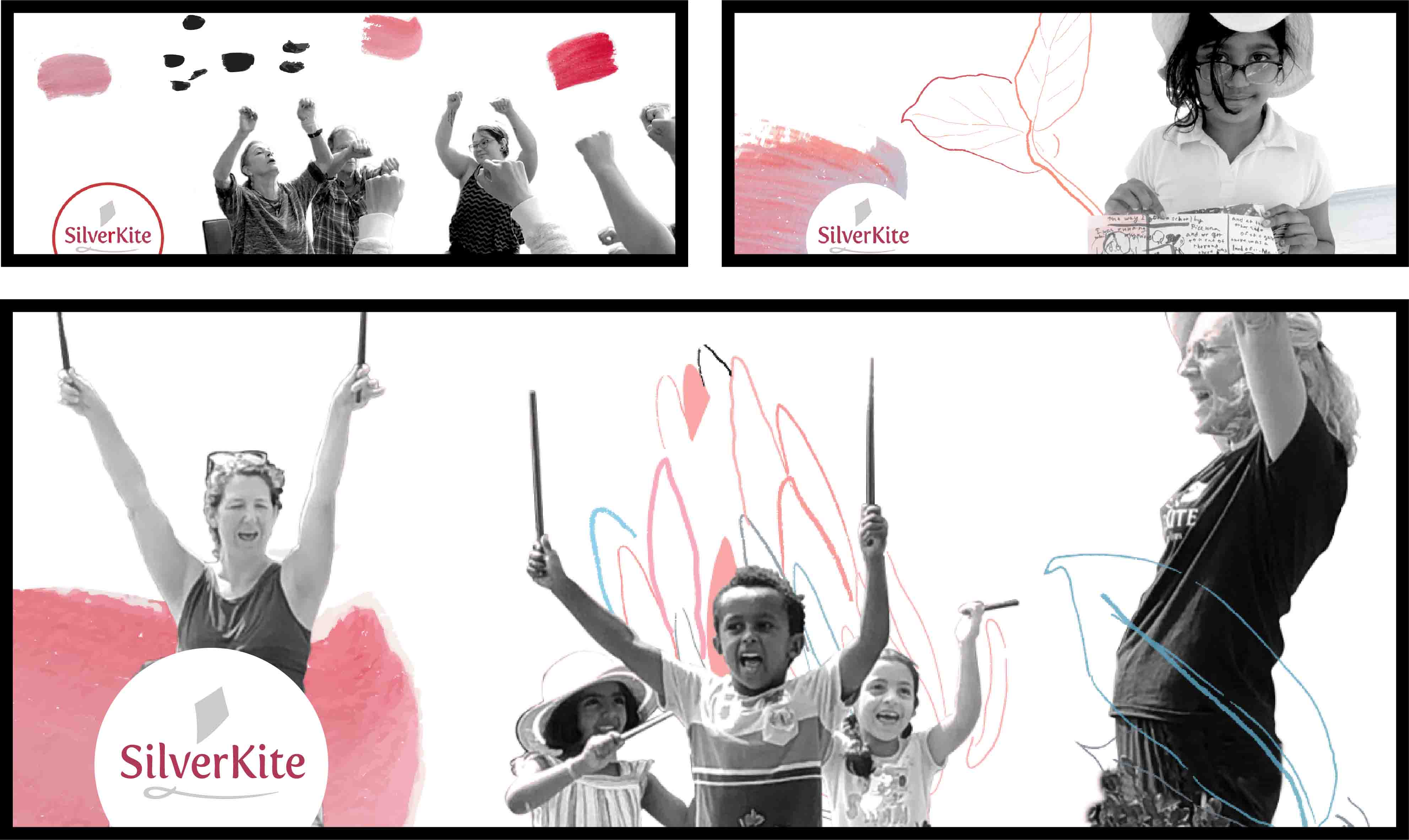
By drawing from the brand characteristics and augmenting with more material, the moodboard took shape. Warm, painterly brushstrokes reflected SilverKite’s work as an arts workshop provider. A focus on people and human elements underscores the relationships and connections that are the foundation of SilverKite’s work.

Iterations & Insight
As the iterations developed, I saw the potential in allowing the participants in the workshops to become the focal point of the entire rebrand. This aligned strongly with what the client had said in earlier discussions, which is that the true purpose of her business is not to teach art, but to connect people.
I asked for photos of participants from the client and immersed them in artistic brush strokes. The first step toward the brand’s visual vocabulary was taken.
LOGOS
Logo Process
Over the course of several iterations, a logo direction was selected and refined. Putting the logotype in the sky, between the “ground” and the kite icon, created a breezy elevated feel. As the process progressed, the logo became simpler and clearer.


Logo Family
The logo family is small and consistent in order to create a recognizable brand for a small business. As requested, two options were provided one with the tagline and the other with the kite string.
CONCLUSION
Reflections
The SiverKite rebrand was a rewarding experience and made a satisfied customer. I had the opportunity to work closely with my longtime friend and boss Jen Kulik, as well as test out my rebranding techniques with a real client.
My lesson learned from this project is that the success of a brand often comes from listening to and reflecting the values of the client. If those values are reflected to the client in new and unexpected ways, they can still succeed as authentic expressions of the brand.
Visit the SilverKite Website at www.silverkite.us.